A rich component library, still in development, for providing experiences from Microsoft’s Fluent design system
Fluent Blocks presents an exciting opportunity for developers looking to seamlessly integrate Fluent and UI Kit designs into their app development workflows. This set of packages is designed to facilitate the creation of fully interactive and accessible experiences, aligning closely with popular design systems. With comprehensive documentation for each package, developers can get started quickly and effectively.
However, it’s important to note that Fluent Blocks is currently not recommended for production use as it is still being vetted. Thus, while it offers promising tools for developers, caution should be exercised with its implementation at this stage.
Comprehensive Packages: Each package includes an detailed overview and setup instructions to help developers get started quickly.
Interactive Experiences: Designed to create fully interactive applications that align with the Fluent and UI Kit aesthetics.
Accessibility Focus: The tools prioritize accessibility, ensuring that applications built with Fluent Blocks can be enjoyed by a wider audience.
Version Specification: For optimal performance, it’s recommended to specify a particular version when installing packages, avoiding the use of range specifications.
Community Support: Dedicated help and community channels are available for developers to seek assistance and engage with other users.
Contribution Opportunities: Developers interested in contributing to the project’s evolution are encouraged to participate through open issues or the contributing guidelines provided.
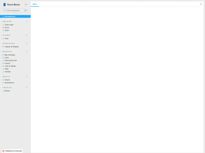
Storybook Integration: The React package is enhanced with Storybook, making it easier to visualize and test UI components during development.