Accessible, CSS agnostic, slider component for React.
Overview
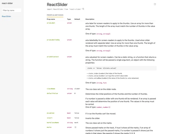
React Slider is an innovative slider component designed specifically for React applications, prioritizing accessibility and user experience. Whether you are integrating it into a complex application or a simple project, this slider provides seamless customization without being tied to any specific CSS framework, making it both versatile and user-friendly.
What sets React Slider apart is its emphasis on accessibility. It ensures that users of all abilities can interact with your slider effortlessly, which is increasingly important in today’s web development landscape. With its clean design and easy implementation, it’s a fantastic addition for developers looking to enhance their UI components while maintaining inclusivity.
Features
- Accessibility Focused: Complies with ARIA standards to ensure all users, including those with disabilities, can easily navigate and use the slider.
- CSS Agnostic: Compatible with any styling framework, allowing complete freedom to customize the appearance without worrying about conflicts.
- Easy Integration: Simplifies the process of adding a slider to your project, making it suitable for both seasoned developers and novices.
- Responsive Design: Automatically adjusts to various screen sizes, ensuring a consistent user experience across devices.
- Smooth Animations: Provides fluid transitions and animations that enhance the visual appeal without compromising performance.
- Customizable Options: Offers a range of properties to tailor the slider’s behavior, such as step counts and value changes, to suit any application needs.
- Keyboard Navigation Support: Allows users to control the slider using keyboard inputs, promoting accessibility and enhancing user experience.