Developed a robust administrative dashboard using React, integrating data from various sources to provide a comprehensive view of operational performance.
Overview
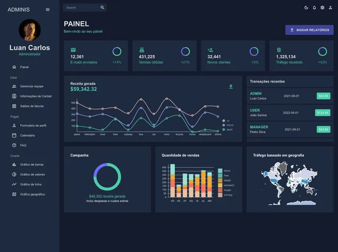
I recently came across a powerful dashboard built with React that truly simplifies complex data into intuitive visualizations. The interface, crafted using Material UI, provides users with instant insights which enhance analysis efficiency. With its smooth integration and responsive design, this dashboard promises an optimized user experience, making data management both effective and aesthetically pleasing.
The author, Luan Carlos, has made a notable effort to utilize modern technologies to create a robust tool for data analysis. This dashboard is an excellent example of how contemporary web technologies can be leveraged to improve user interaction and data comprehension.
Features
- Dynamic Interface: Offers real-time data visualizations that are easy to interpret, helping users make informed decisions quickly.
- Material UI Integration: Utilizes Material Design principles for a clean and intuitive user experience, ensuring that the dashboard is visually appealing.
- Responsive Design: Adapts to various screen sizes, providing a seamless experience across devices, whether on desktop or mobile.
- Nivo Charts: Integrates reusable and elegant graphing components that make data representation both informative and beautiful.
- Full Calendar Functionality: Incorporates an interactive calendar for effective scheduling and time management within the dashboard environment.
- Formik Support: Simplifies form management in React, making data input and validation straightforward and efficient.
- Customizable Sidebar: Features a React Pro Sidebar that can be tailored to meet user preferences, enhancing navigation.
- Validations with Yup: Ensures that all forms are validated effectively, improving data integrity and user input accuracy.