UI Components
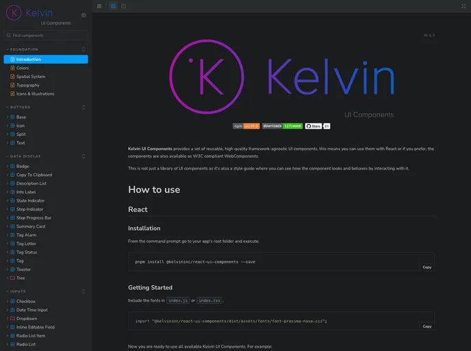
Kelvin UI Components is an impressive suite of reusable, high-quality UI components designed to be framework-agnostic. This versatility allows developers to seamlessly integrate the components with various front-end frameworks like React, as well as utilizing W3C compliant WebComponents. Beyond being a simple library, it serves as a comprehensive style guide, enabling users to interact with the components and see their functionalities in action through Storybook, an efficient open-source tool.
The project embraces a modern development approach, utilizing a monorepo structure for managing multiple packages tailored for different frameworks. This organization not only enhances maintainability but also provides a streamlined setup process for developers aiming to incorporate Kelvin UI Components into their projects.
Framework-Agnostic: Works seamlessly with React and other frameworks, including W3C compliant WebComponents, maximizing versatility.
Interactive Style Guide: Showcases components in action via Storybook, allowing developers to see how each component behaves and looks before implementation.
High-Quality Reusable Components: Offers a set of meticulously crafted UI components that maintain consistency and quality across different projects.
Modern Development Stack: Built using StencilJS, which ensures components are lightweight and performant, enhancing user experience.
Testing with Puppeteer & Jest: Ensures robust testing of UI components, promoting reliability and stability in your applications.
Monorepo Management: Utilizes Lerna for effective management of multiple packages, streamlining the development process for scalability and organization.
Easy Setup: Simplifies the installation process with clear instructions for dependencies and building packages, making it accessible for developers of all skill levels.