Overview
The @ramonak/react-progress-bar is a flexible and visually appealing progress bar component designed specifically for React applications. It provides developers with an easy way to display progress through a range of customizable options. Whether you’re creating a project that requires load indicators, task progress, or other visual guidance, this component is equipped to meet your needs efficiently.
With its streamlined design and useful features, the @ramonak/react-progress-bar aims to enhance user experience while simplifying implementation for developers. It supports a variety of configurations, allowing you to tailor its appearance and functionality to fit seamlessly within your project.
Features
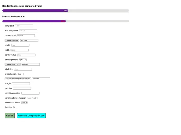
- Completed Value: Accepts both numbers and strings for the completed progress value, with the option to exclude “%” from the label.
- Max Completed Value: Flexible setting that allows you to define a maximum value beyond 100, providing greater granularity to your progress indications.
- Custom Label: Easily implement a unique label to customize the display according to your design requirements.
- Background Color: Specify the color of the completed bar using hex codes, ensuring alignment with your project’s branding.
- Adjustable Height: You can set the height of the bar, accommodating various design layouts and screen sizes.
- Variable Width: The width of the progress bar is customizable from 1% to 100%, offering flexibility in design.
- Margin and Padding Options: Add space around the progress bar with adjustable margin and padding settings for a polished look.
- Border Radius: Modify the border radius for rounded corners to achieve the desired aesthetic, whether it be sharp or soft edges.