A fully customizable datetime picker component library made with and for React.js
Overview:
The React Datetime Picker is an impressive and fully customizable component library that integrates seamlessly with React.js applications. It simplifies the process of selecting dates and times, providing developers with a user-friendly interface that enhances the user experience. With a focus on flexibility and ease of use, this library is perfect for both developers looking to streamline their code and users who appreciate intuitive design.
Features:
- Customizable Options: Easily tailor the datetime picker to fit your specific use case with a variety of customization options.
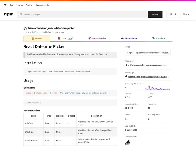
- Date Constraints: Set minDate and maxDate properties to disable selections outside the specified date range, ensuring valid input.
- Default Selection: The defaultValue prop allows you to set an initial date, so users can see a pre-selected value when they open the picker.
- Submit on Change: With the submitOnChange option, you can eliminate the need for a submit button, allowing for seamless auto-submission when a date is clicked.
- Easy Installation: Quickly integrate the library into your React project with a straightforward installation process.
- Well-Documented: Comprehensive documentation provides clear guidance on usage and customization, making it accessible for all skill levels.
- Active Community: Contributing is encouraged, making it a project worth engaging with as it evolves.