Overview
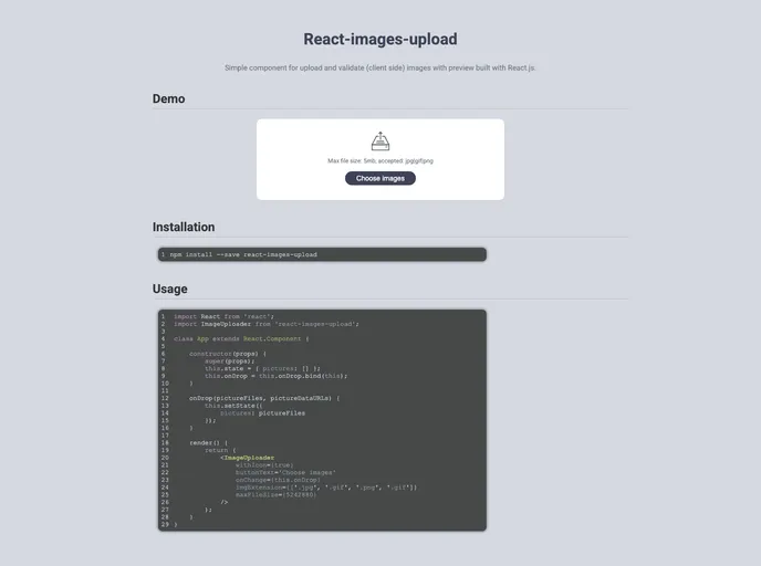
The Images Uploader UI Component is a versatile tool designed for seamless image upload and validation on the client side, built elegantly with React.js. This simple yet powerful component allows users to not only upload images but also preview them before finalizing their choice, making it a fantastic option for any web application requiring image input. With its user-friendly interface and customization options, it helps enhance the overall user experience significantly.
This component utilizes ‘react-flip-move’ to animate the file previews, ensuring that every interaction feels smooth and visually appealing. With various installation and usage features, including support for both class and hooks approaches in React, this uploader stands out as an efficient solution for developers looking to implement image uploads into their projects.
Features
- Customizable Class Names: Easily apply your styles through customizable class names for both the input and button elements.
- Image Preview: Supports real-time previews of selected images, providing users with immediate visual feedback.
- Default Images: Pre-populate the uploader with designated default images, ideal for showcasing uploads or maintaining continuity in design.
- File Type Acceptance: Adjustable accept attribute allowing only specific image types (e.g., JPG, GIF, PNG) to ensure valid uploads.
- Error Messages: Built-in error handling with clear messages for file size and type validation, helping users rectify issues promptly.
- Inline Styles: Use inline styles for both buttons and labels, offering further customization for individual project needs.
- Upload Icon and Labels: Optionally include an upload icon and instructional labels, enhancing usability for end users.
- Max File Size Control: Specify a maximum file size limit to prevent oversized uploads, keeping your application in check.