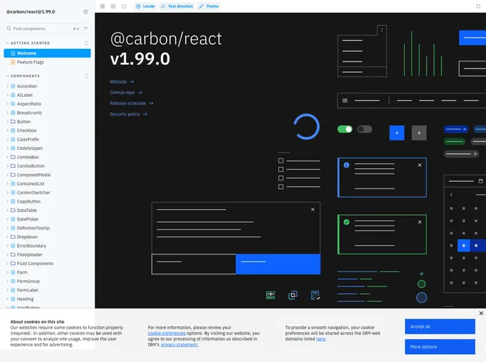
React components for the Carbon Design System
## Overview
Carbon Components React provides a comprehensive set of React components built specifically for the Carbon Design System. These components are crafted to follow the design principles set by IBM's Carbon, ensuring a cohesive and user-friendly experience across applications. As businesses increasingly adopt React for their user interfaces, having a reliable library that integrates with Carbon's design ethos can significantly enhance development efficiency and maintain design integrity.

With a focus on accessibility and responsiveness, Carbon Components React promotes not only visual consistency but also usability for all users. These components allow developers to streamline their workflow while adhering to best practices in web development. Whether you are building enterprise applications or dynamic web interfaces, this library serves as an essential toolkit.

## Features
- **Comprehensive Component Library**: Offers a wide range of pre-designed components, from buttons to modals, ensuring developers have the tools they need to create consistent UIs.

- **Accessibility Support**: Each component is designed with accessibility in mind, making it easier to build applications that are usable by everyone, including those with disabilities.

- **Theming Capabilities**: Easily customize the appearance of components through theming options, allowing for flexibility to match branding requirements without compromising the design integrity.

- **Responsive Design**: Components automatically adapt to different screen sizes, providing an optimal user experience across devices.

- **Developer-Friendly Documentation**: Well-structured documentation and examples ease the onboarding process for developers and make implementation straightforward.

- **Active Community Support**: Benefit from a vibrant community that continually contributes to enhancements, bug fixes, and shared learning experiences, ensuring the library remains up-to-date.

- **Integration with Existing Systems**: Components can be seamlessly integrated into existing projects, allowing for gradual adoption without complete rewrites.