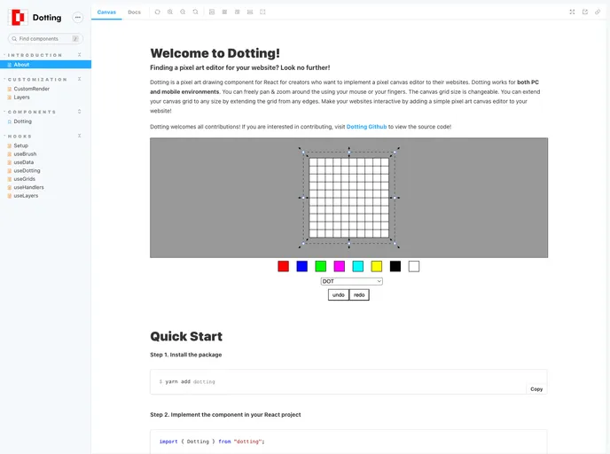
Dotting is a pixel art editor component library for react
The Dotting component is an innovative tool designed for creating interactive canvases, perfect for artists and developers alike. This component offers incredible flexibility, allowing users to customize their artistic experience with various props. Whether you’re building a drawing application or enhancing a creative project, the Dotting component provides an intuitive and powerful way to engage with digital art.
With an easy installation process and straightforward setup, users can quickly integrate this component into their projects. The ability to customize aspects such as size, background color, and visibility of the grid makes this component a valuable addition for anyone looking to enhance their creative workflow.
width and height props, which accept both string and number values for flexibility.gridStrokeColor and gridStrokeWidth, allowing users to tailor their workspace to their preferences.backgroundColor prop enables users to personalize the canvas background, enhancing the overall artistic experience.initLayers prop to define initial drawing layers, providing the option to start with a default layer or customize as needed.isPanZoomable to true, adding more functionality for detailed work.style prop facilitates the addition of custom styles to the canvas, ensuring it fits seamlessly into your overall project design.ref prop with a refObject created using useRef<DottingRef>, allowing for further manipulations of the component.isGridVisible prop, giving users the choice to work with or without grid aids.