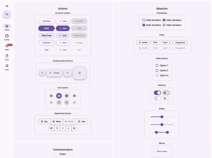
Material Web Components for React
Material Web Components for React is an innovative wrapper designed to integrate seamlessly with the React ecosystem, providing a customizable and accessible approach to Material Design standards. Utilizing the official web components from Google, this library aims to enhance the development experience by ensuring that React developers have access to the latest UI components with ease. Whether you are starting a new project or looking to enrich an existing application, the combination of robust functionality and open-source availability makes it an attractive choice.
This library is particularly recommended for use alongside MUI, creating a powerful development synergy. With an emphasis on local installation and open-source contributions, Material Web Components for React invites developers not just to use the library but to participate in its evolution, ensuring a product that remains responsive to the community’s needs.
Open Source: Material Web Components for React is free to use and modify, with a strong community backing for ongoing improvements.
Customizable: The library allows developers to tailor components as per their project requirements, ensuring flexibility with design and functionality.
Accessibility First: Designed with accessibility in mind, the components conform to web standards, making applications usable by everyone.
MUI Compatibility: Recommended to be used alongside MUI, this integration allows for a more powerful UI toolkit that developers can leverage.
Local Development: Simplifies the development process with a setup that allows for local installations and quick component integration into React applications.
Robust Roadmap: An active development roadmap with planned features such as theming through Tailwind and enhanced TypeScript support keeps the library on the cutting edge of modern web development.
Native Web Component Support: By utilizing native web components, the library ensures high performance and lower overhead in managing component states.
Community Contributions: Actively encourages developers to participate in enhancing the library, with clear guidelines for contributing and improving components.