A Mantine UI Library Extension Flip component
The Mantine Flip component provides an engaging way to create UI elements that can efficiently toggle between two states. Perfect for applications that prioritize progressive disclosure, such as editing panels or profile detail toggles, this component delivers both functionality and aesthetics. With its easy-to-use interface based on the Mantine library, developers can quickly implement intuitive interactions within their apps.
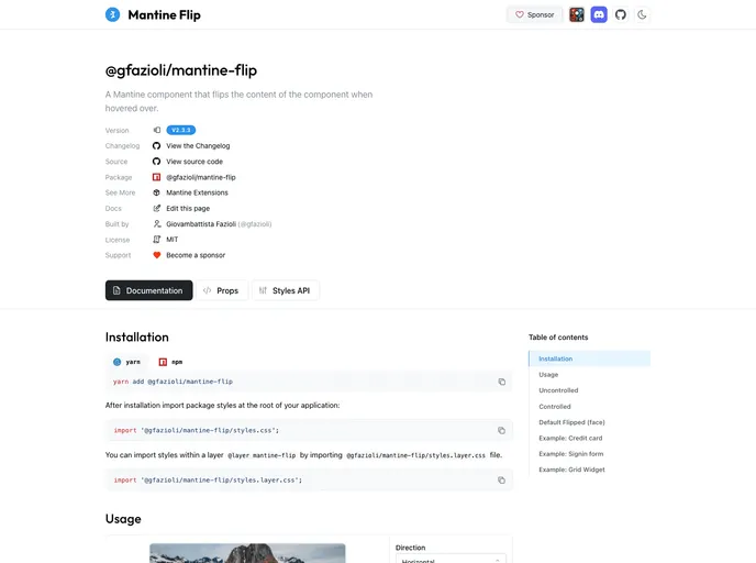
What sets the Mantine Flip component apart is its flexibility in usage. It supports both uncontrolled and controlled implementations, making it suitable for a variety of use cases. Whether you want to keep it simple or fully integrate the component with your app’s state management, Mantine Flip has got you covered.
Two-Face Animation: The component seamlessly animates between front and back views, enhancing user interaction while conserving space in your UI.
Uncontrolled and Controlled Modes: Use Flip.Target to trigger animations with any element in uncontrolled mode, or manage the flips directly through your React state for controlled functionality.
Custom Transition Options: Personalize the flipping experience with customizable transitions, including vertical flips and specific rotation directions for smooth animations.
Refined Styling Hooks: Utilize classNames and the Styles API to target inner component parts for tailored styling, ensuring your design aligns perfectly with your application’s aesthetics.
Practical Examples: The component comes with demonstrative patterns, showcasing its utility in various scenarios like credit-card editing or modal settings panes.
Size Constraints: Enforce size restrictions for the component, providing the necessary adaptability for different layout needs within your app.
Sponsorship Support: Backing this open-source project not only helps maintain its active development but also encourages contributions that enhance its capabilities over time.