Overview
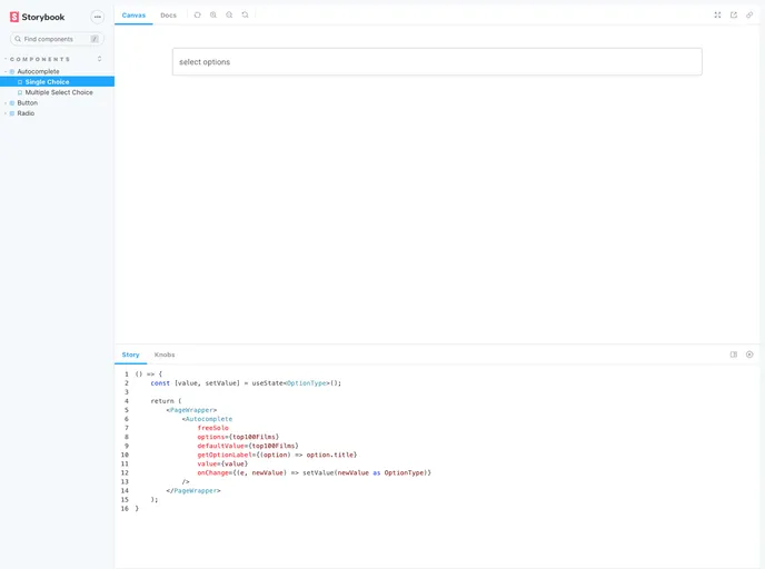
If you’re looking to enhance your React application, a Storybook setup based on Material-UI and TypeScript is an excellent choice. This powerful tool allows developers to create isolated components and visualizations of their React components, making it easier to build and test UIs in a modular fashion. The integration of Material-UI ensures that your components are not only functional but also visually appealing and consistent with Google’s Material Design guidelines.
Getting started is a breeze, and with simple commands, you can both initiate your development environment and deploy your Storybook to GitHub Pages. This seamless workflow is a great advantage for developers who want to focus on creating and showcasing their components.
Features
- Easy Setup: With just a few commands, setting up your Storybook environment is quick and straightforward.
- Component Isolation: Develop and test components in isolation from the rest of your application, allowing for focused development.
- Material-UI Integration: Utilize a well-designed UI library that conforms to Material Design principles, providing a modern look to your components.
- TypeScript Support: Write your components with type safety in mind, reducing potential runtime errors and enhancing maintainability.
- GitHub Pages Deployment: Easily publish your Storybook as a static site using optimized build commands, making it accessible for sharing and feedback.
- Live Reloading: Experience immediate feedback as you develop, thanks to hot reloading features that keep your workspace responsive.
- Interactive Documentation: Create rich documentation alongside your components, allowing users and developers to explore the features and usage in a user-friendly manner.