MAAS React Component Library
The MAAS React Components library offers a robust collection of components tailored specifically for MAAS UI projects. This library not only enhances development efficiency but also maintains a coherent visual and functional aspect throughout applications built with MAAS. By focusing on components that are exclusive to MAAS, developers can ensure that their projects utilize best practices and adhere to the necessary guidelines.
In addition to improving application development, the library emphasizes a smooth integration process for those who wish to customize or add new components. Whether you are an experienced developer or just starting with MAAS, the framework provides the tools and guidance you need to create intuitive interfaces quickly.
Tailored Components: Designed specifically for MAAS projects, these components ensure a seamless integration and functionality unique to the MAAS UI.
Development Ease: The library allows for immediate reflection of changes made to components, streamlining the development process and enhancing productivity.
Component Creation Workflow: A simple command (npm run create-component) aids in generating a new component with necessary files and initial setups, fostering consistency and best practices.
Storybook Integration: Each component created includes a Storybook story, facilitating better visualization and testing of components in isolation.
Symlink Support: By utilizing symlinks, developers can easily link the local version of MAAS React Components to their consuming applications, simplifying development and testing.
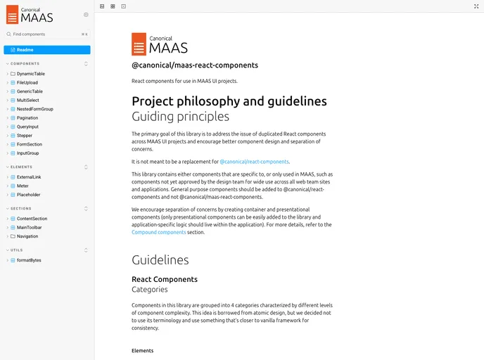
Comprehensive Guidelines: Access to React Components Guidelines ensures that developers follow recommended practices when creating or modifying components, promoting code quality and maintainability.